When I started building websites more than a decade ago, I never thought much about the words I put on my web pages.
All of my headings were some version of "Welcome to Joe's Website," my subheadings were completely improvised, and my body copy was pulled out of thin air.
I had no idea what I was doing.
In the world of websites, no one talks about the words we write. You'll find a million tutorials for web development, design, and hosting but nothing for copywriting.
It's too bad. Words are the most important thing on your site. They captivate, educate, and convince.
I desperately needed someone to show me how to write simple, compelling copy that could transform my websites into powerful communication tools rather than just flashy pieces of software.
That's when someone gave me a book that changed my life. It’s called Building a StoryBrand by Donald Miller.
In this book, Miller provides a framework for website copy. He shows step-by-step how to strategically and thoughtfully construct the most essential and popular page on any website: the home page.
Here's a compact, straightforward, StoryBrand-inspired guide to every section you'll ever need to put on your website's home page.
1. THE HEADER
Clarity over cleverness is my favorite rule in copywriting.
I apply this rule to every page on a website but especially the home page's header.
You've got about 15 seconds to let someone know they're in the right place before they click away.
The header is your first impression and gets more eyeballs than anything else on your website.
Don’t waste it.
Here’s what your home page’s header needs to do:
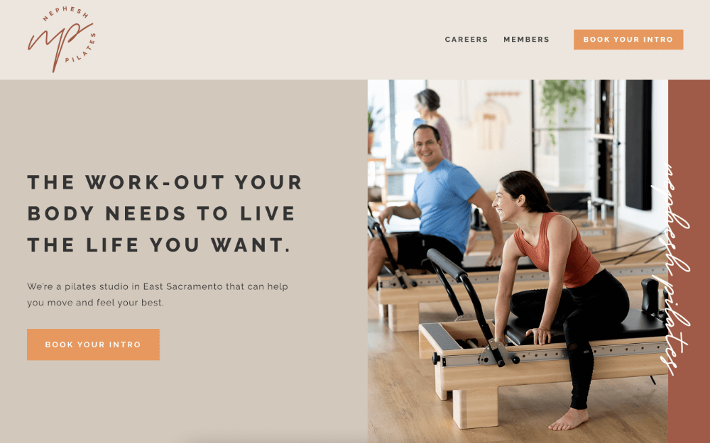
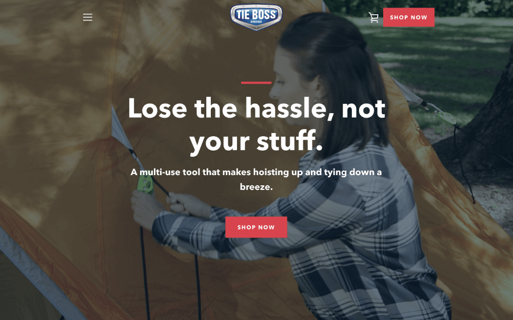
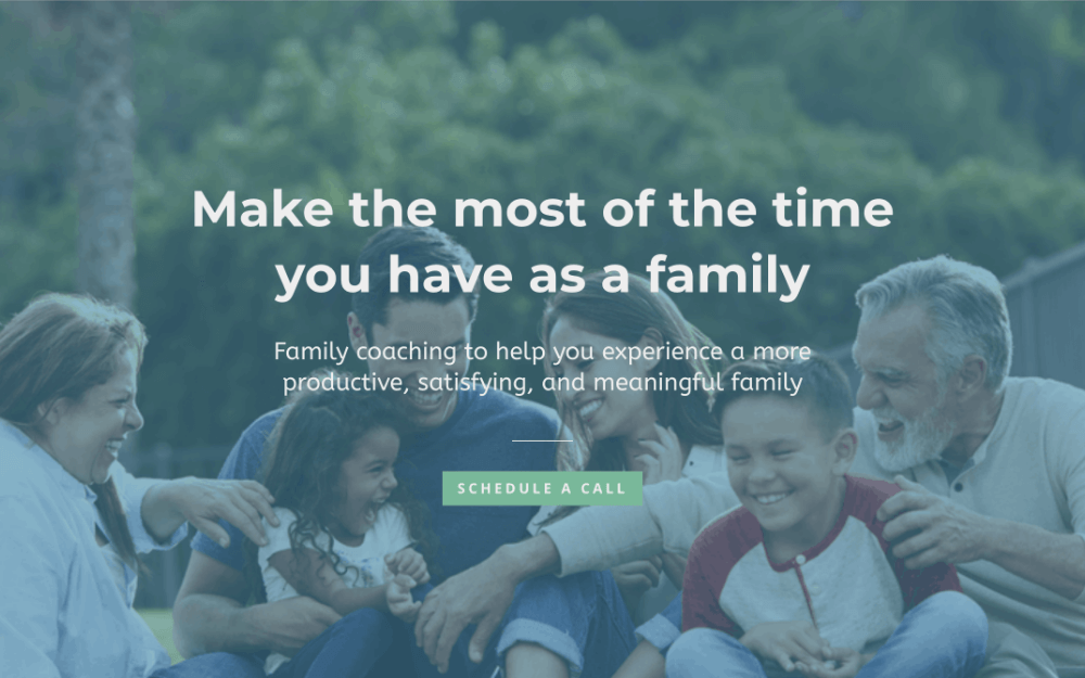
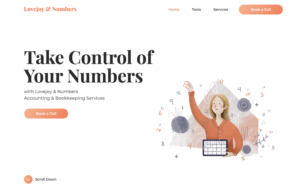
CLEARLY STATE WHAT YOU OFFER
Many feel they need to write poetically to get attention. But poetic language will often confuse and deter people more than it reels them in.
Your site's visitors just want to know if they can benefit from you in some way. If it's not obvious what you offer, they will leave.
"We Fix Computers Quickly and Affordably" says what you do. The more poetic version, "Solutions to Tackle Today's Biggest Challenges" says nothing.
What solutions? What challenges? Do they even work with computers? I think I'll go somewhere else.
DESCRIBE THE IDEAL OUTCOME
Your visitor wants to know that your definition of success is the same as theirs.
If it's not apparent that you each want the same thing, it could make them hesitant about moving forward.
The following describes the ideal outcome for someone with a glitchy computer who doesn't want to deal with it anymore:
"Hassle-free tech support that gets you back to work, doing what you love."
TELL THEM WHERE TO GO
How do you want people to engage with your offer?
Maybe you want them to call you or fill out a contact form or drive to your store.
Whatever it is you want them to do, place a big, colorful button in your header that calls them to action and directs them to that next step.
Here are some good call-to-action buttons:
- Order Now
- Buy Now
- Sign Up Now
- Shop Now and Save
- Contact Us
- Get Directions
- Donate
- Get a Quote
- Get Tickets
- Get Started
- Give Us a Call
- Start Your Free Trial
- Book an Appointment
- Schedule a Free Consultation
Be sure to repeat this call to action throughout your website.
CTA buttons are a great way to ensure that your visitor is never confused about how to take you up on your offer.
EXAMPLES
2. THE PROBLEM SECTION
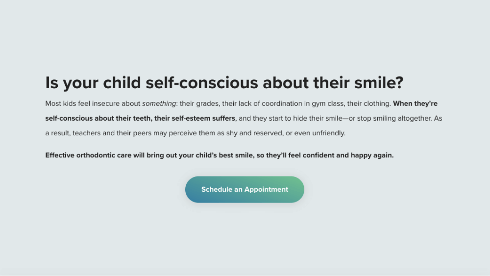
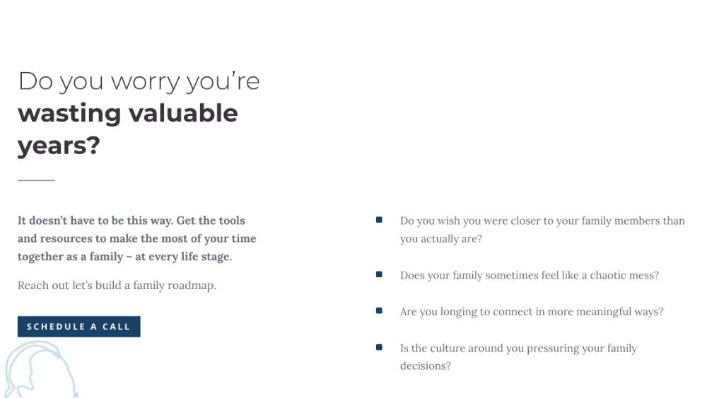
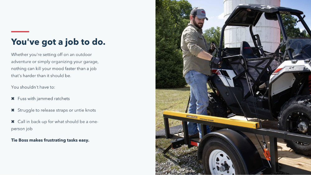
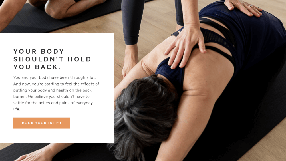
The header made it clear that you offer a successful resolution to your visitor’s problem.
The problem section is where you remind them what life is like when their problem goes unresolved.
SHOW THAT YOU UNDERSTAND THE PROBLEM
Empathize with your visitor’s fears and frustrations.
By demonstrating that you thoroughly understand how they feel, you instill confidence in the reader that you know what it takes to fix their issue.
Here are some empathetic, StoryBrand sentence-starters courtesy of Donald Miller:
- We understand how it feels to…
- Nobody should have to experience…
- Like you, we are frustrated by…
TALK ABOUT THE CONSEQUENCES
Your visitor is trying to avoid the consequences that their problem causes.
Just like in the header when we gave them a glimpse of the ideal outcome, there’s also a bad outcome waiting for them if they don’t take action.
Don’t scare them, just give them a heads up.
Here are some consequences you could mention:
- More confusion
- Wasted time
- Underperformance
- Loss of focus
- Missed opportunities
- Stress and anxiety
PRESENT YOUR OFFER AS THE SOLUTION
You’re now teed up to hit a home run.
You get where they’re coming from, you know the stakes they’re dealing with, and you know the perfect solution.
Restate your offer and the ideal outcome one more time in a way that addresses each of the consequences you brought to your visitor’s attention.
Copy your CTA button from the header and paste it right here. Your visitor’s fears and frustrations will be put at ease if they click it.
EXAMPLES
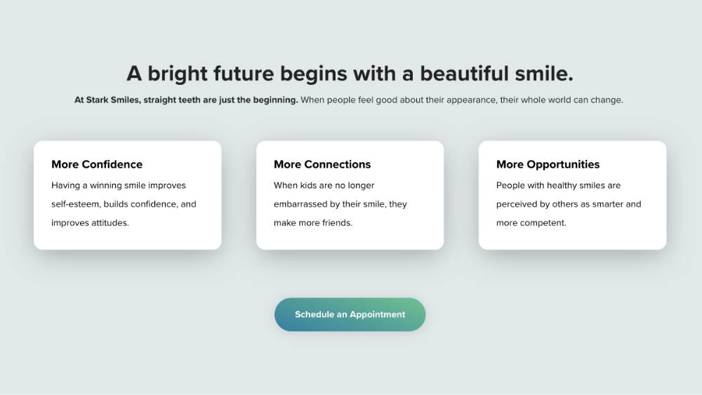
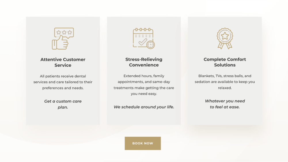
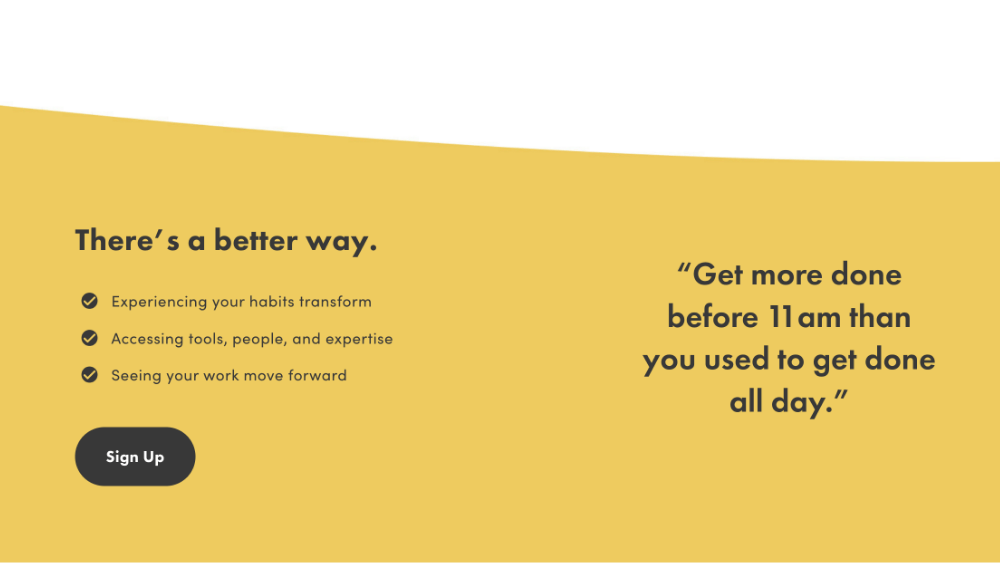
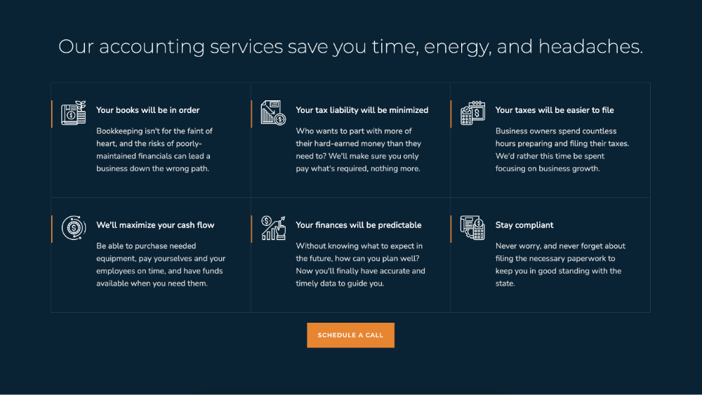
3. THE VALUE SECTION
You don’t buy a car just to own one. You buy a car because it improves your life.
Your first car gives you freedom. A hybrid car saves you money on gas. A fast car is fun to drive.
A car adds value.
Think of a few ways your offer will add value to someone’s life. For example:
- Save money
- Save time
- Reduce risk
- Eliminate stress
EXAMPLES
4. THE PROOF SECTION
How can you prove to your site’s visitor that you have what it takes to solve their problem?
Here are some great ways to let people know that you can talk the talk and walk the walk:
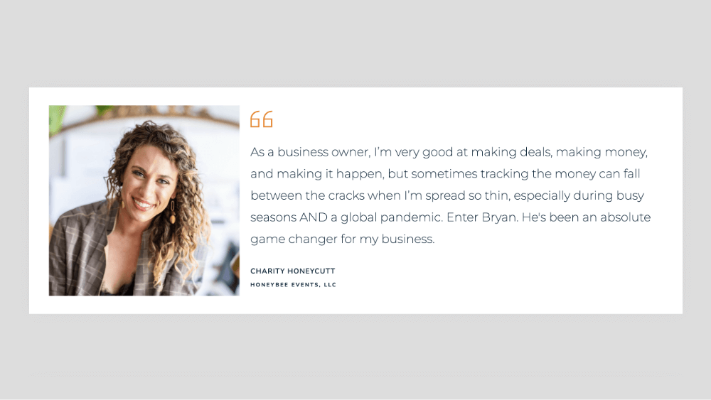
- Testimonials from people you've helped
- Case studies that show off your work
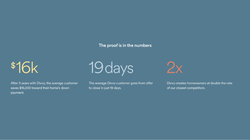
- Statistics that quantify your impact
- Press articles and videos that mention you
- Logos of respected companies you’ve worked with
EXAMPLES

!["After having a baby, exercise can be a little scary. My body didn’t feel the same with atrophied muscles and lots of pain. What I’ve gained at Nephesh Pilates is the self-care [and movement] I need as a new mom.” - Laura](../images/66760912c03df7927b773946_62f6d59276402762211d6125_Group-3.png)
5. THE PROCESS SECTION
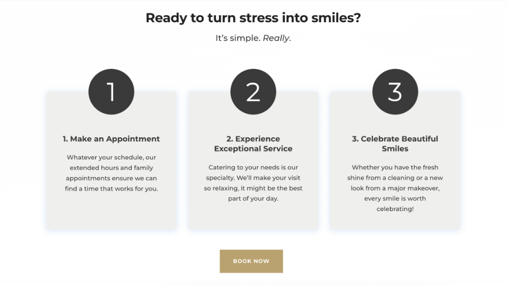
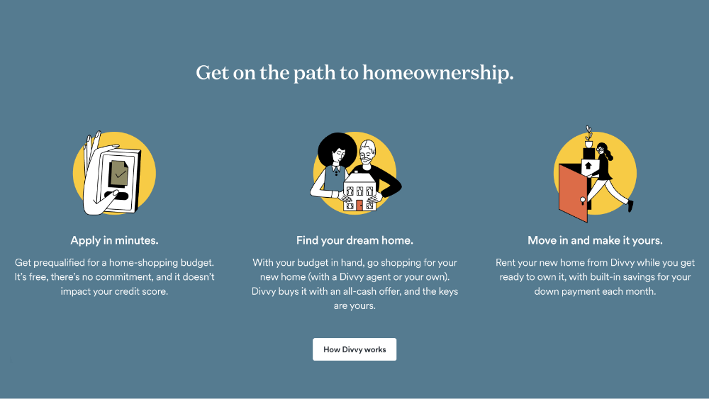
People will not walk into a fog. If someone is unsure of the steps they need to take to accept your offer, they’ll back out.
The process section is where you can put your visitor at ease by showing them just how easy it is to work with you.
The more steps you have in your process, the more difficult it begins to look.
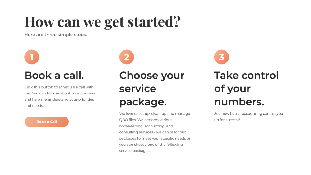
You might have 7 or 8 steps in your process but do yourself a favor and try to combine those steps into three separate phases.
The simpler your process is, the more appealing it will be to your visitors.
Having three steps keeps things simple and easy.
EXAMPLES
6. THE OTHER STUFF
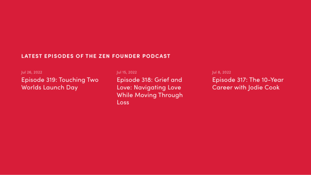
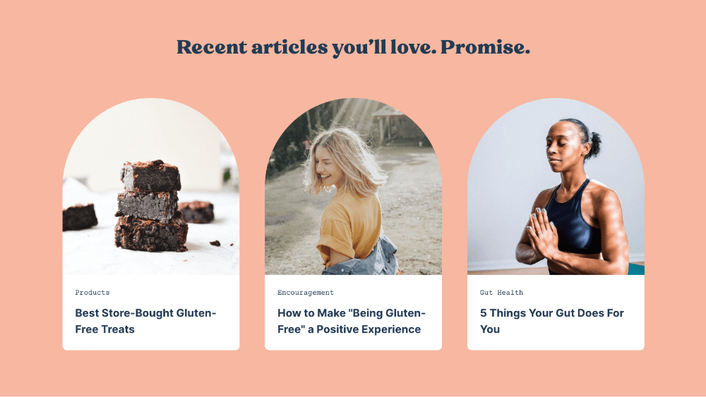
Most websites contain more than just a home page. There are usually secondary pages as well like Blog, Events, Products, Services, etc.
But these pages easily get lost on your site because they are buried behind the home page.
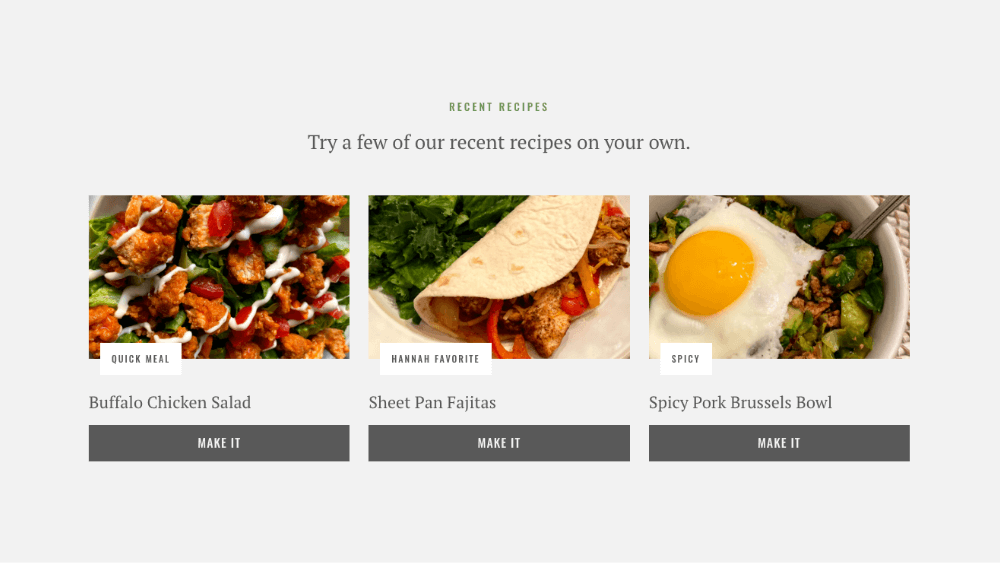
If you feel that your visitors are missing out on key pieces of information contained on these secondary pages, bring a sample of each page to the front using a teaser section.
EXAMPLES

7. THE FOOTER
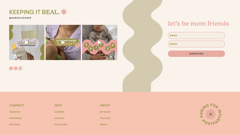
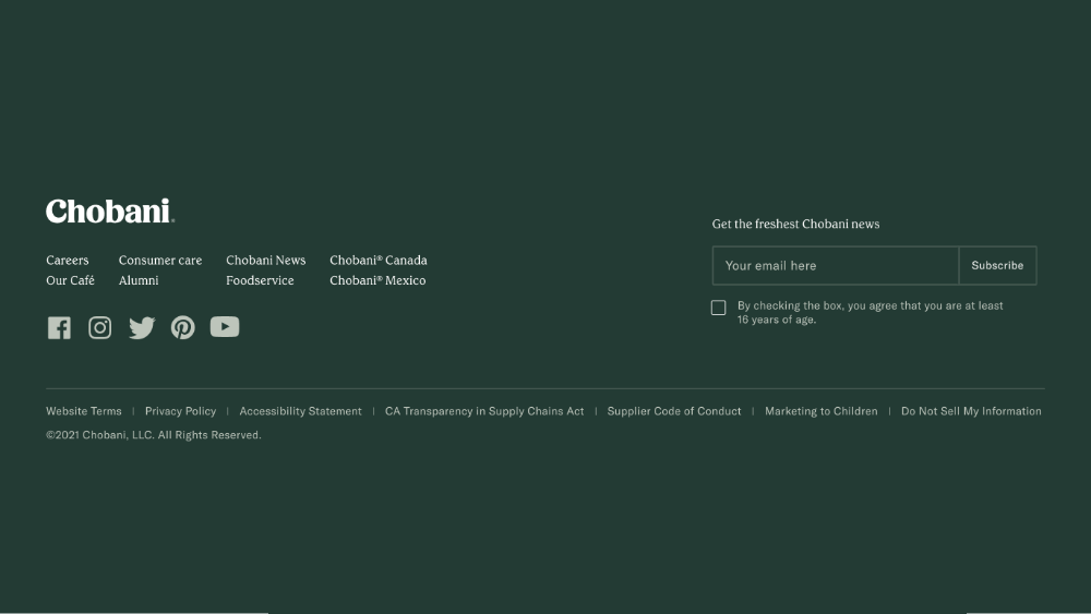
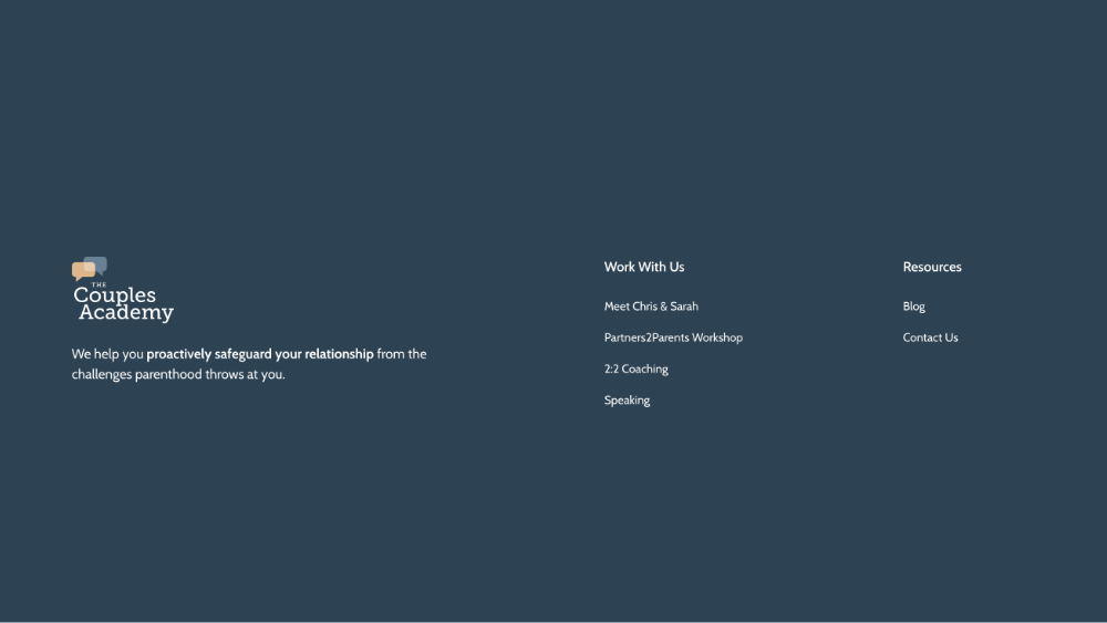
STORE EXTRA LINKS
Some websites have so many links in the top nav you become paralyzed by all of the options.
Putting links in the footer keeps the top nav uncluttered and focused on your most important pages.
If people are looking for secondary pages like Careers, About Us, or Contact Us, they’ll be more than willing to scroll for them.
ELIMINATE DEAD ENDS
Eventually, your visitor will leave but hopefully, it’s not because they’ve run out of things to engage with on your site.
Imagine scrolling to the end of your home page, and seeing that there’s nothing left to look at or click. You’re practically ushering people out the door.
Placing links in your footer creates opportunities for your visitor to stay.
The longer people stay on your site, the more likely they are to click your call-to-action button.
Another great thing to put in your footer is a newsletter signup form.
A newsletter is a surefire way to keep visitors in the loop even after they’ve closed their browser window.
EXAMPLES
THAT’S IT!
Building a StoryBrand by Donald Miller has been a lifeline for me. I could not recommend his books enough.
Many of the concepts in Building a StoryBrand can also be found in his newer book Marketing Made Simple. I would probably read that one first.
If you’ve found this guide helpful, I hope you'll share it with your friends or bookmark it and refer back to it whenever you start a new website or page.

